As the sole product designer at LivinFrance, I identified that our housing booking journey was losing most users before conversion — a direct hit to our ability to generate recurring revenue.
I started by pulling data from the existing funnel (the only data available at the time), which revealed a clear trust problem among our users:
Listings → Listing detail → Payment breakdown → Booking form
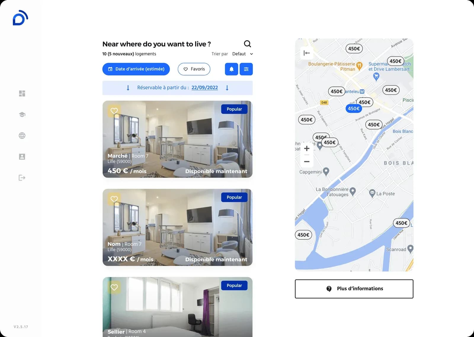
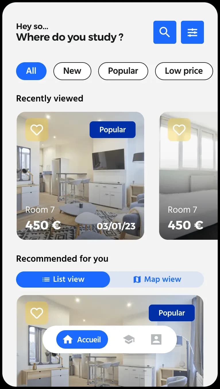
Listings
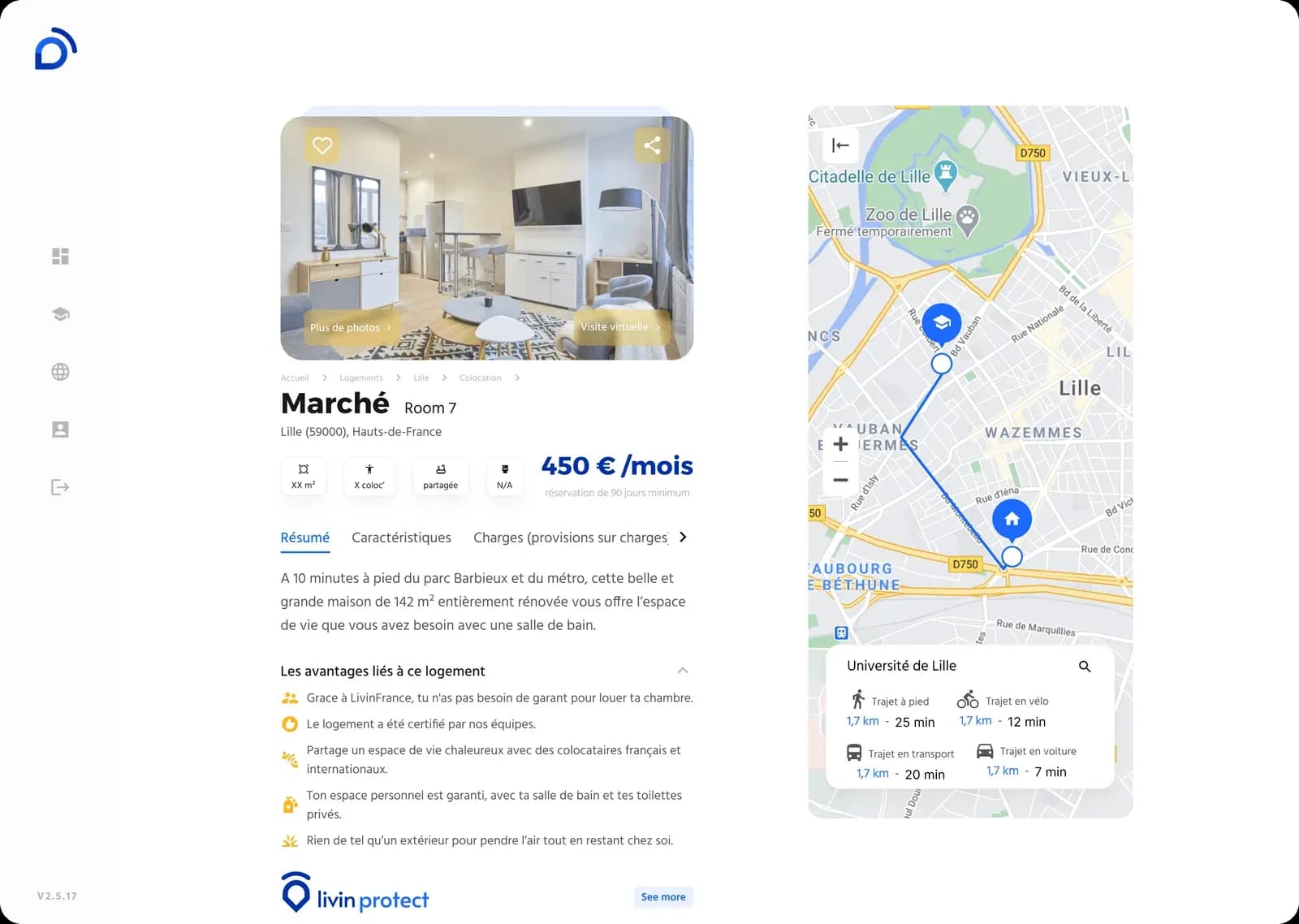
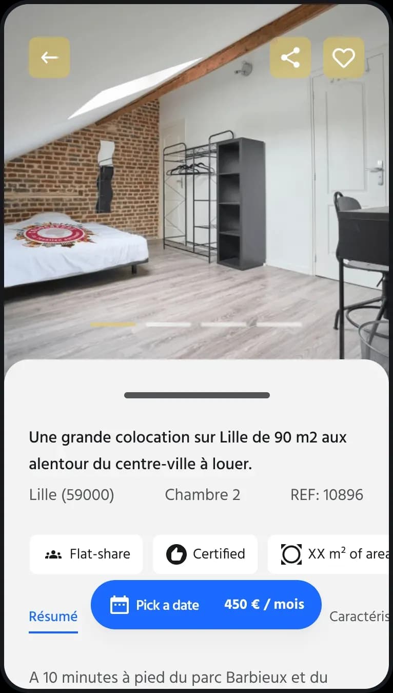
Listing detail
50% of users dropped off between the payment schedule explanation and the completed personal information form, and a further 90% after the payment step itself.
To understand precisely what was blocking users, I had the customer support team interview users and surface the friction points in the journey.
Users hesitated on the page detailing the full payment schedule, overwhelmed by the number of installments. I chose to keep that transparency rather than remove it. Hiding it would have reduced short-term drop-off, but would have recreated the trust problem later in the journey, at the point of future payments. So I restructured the display to show only the steps remaining before booking, rather than the entire payment calendar at once.
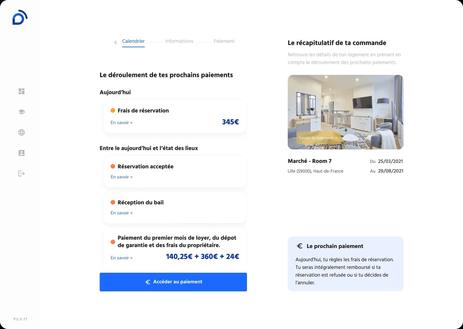
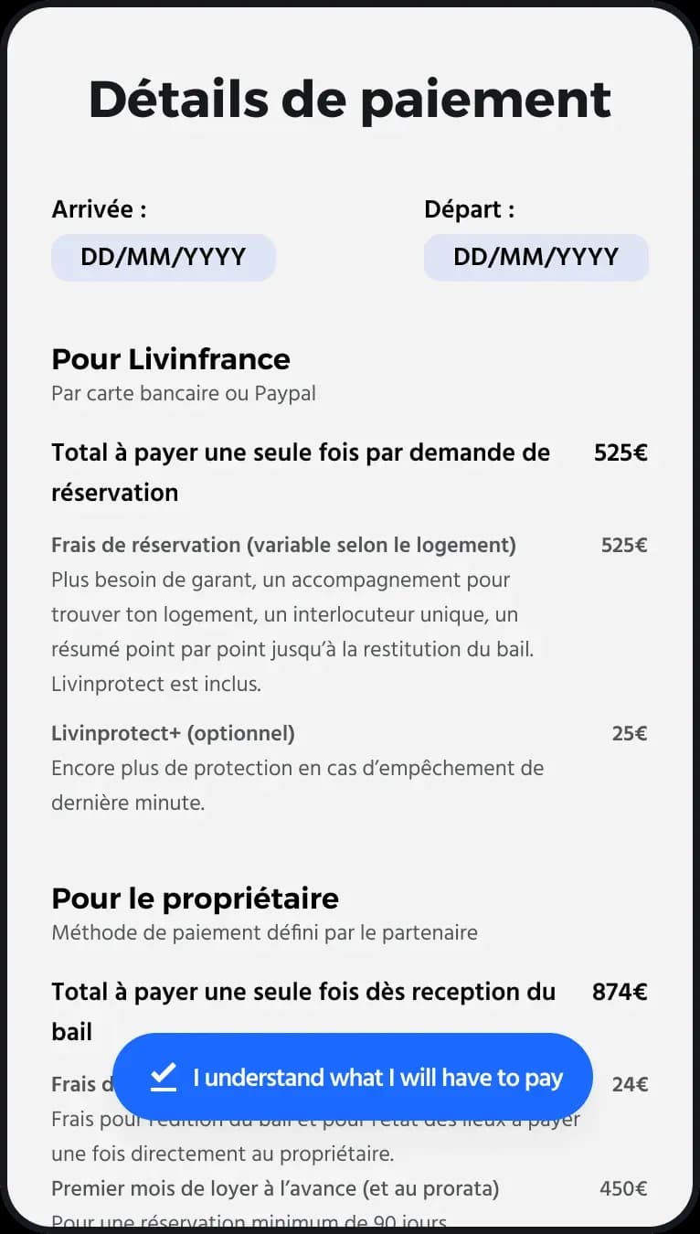
Payment schedule, restructured to show only the remaining steps
The second, bigger problem was the personal information form: most users couldn't get through it. Digging deeper, it turned out most of these fields weren't actually needed at this stage of the journey, and their sheer number discouraged users to the point that some left the funnel to book with a competitor.
I cut the form from 8 fields to 3, keeping only what was genuinely essential at this stage, replaced the calendar picker with three dropdown menus, and removed the "City," "Postal code," "Region," and "Country" fields — too specific to the French address format — in favor of a single address field powered by Google autocomplete, usable regardless of address format.
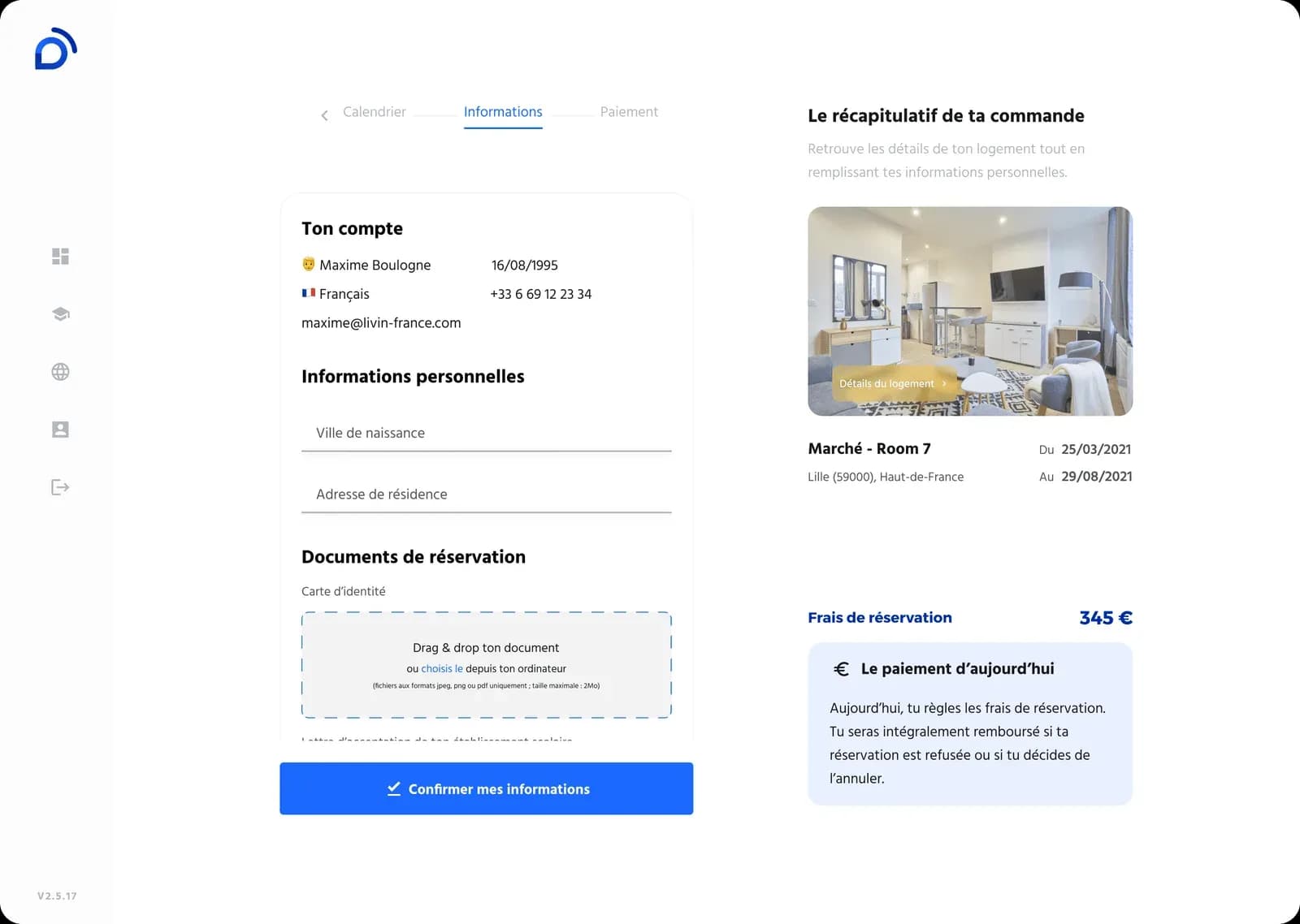
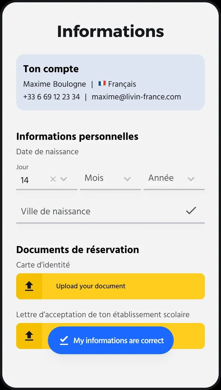
Form reduced from 8 to 3 fields
The remaining adjustments addressed information users systematically asked our support team about, so the journey no longer needed to be explained.
Result: Users progressed significantly further through the funnel, all the way to actual booking, where the majority previously dropped off before even completing their information.
Listings → Listing detail → Payment schedule explanation → Information request to build the file → Payment
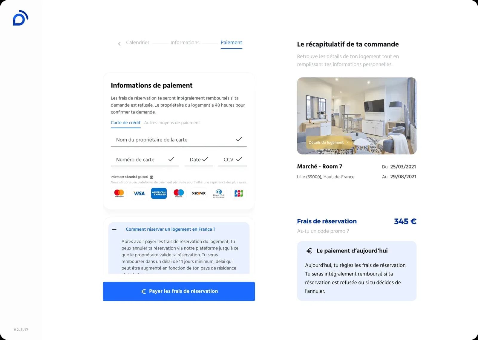
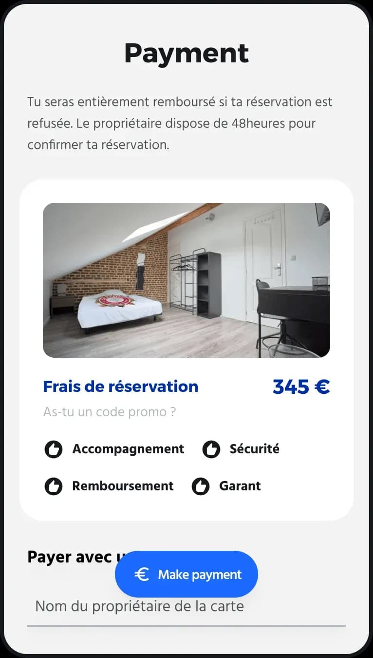
Final payment
What I'd do differently today
- Contrast of floating elements: buttons overlaid on photos (back, share, favorites) used a light background with white icons — insufficient for accessibility (AA ratio) and illegible on very bright photos. Today, I'd systematically use a dark, semi-opaque scrim behind these elements regardless of the background content.
- Touch targets: several clickable zones (secondary navigation, photo actions) were under the recommended 44×44px. Something I now build into my specs by default.