TL;DR: Smatch sat at the center of a fragmented ecosystem: seven different tools, scattered data, hard-to-follow journeys, and a heavy mental load for pricing managers. I led the UX redesign to create a unified Competitor Experience, capable of aligning information across multiple sources, clarifying decisions, and considerably improving the fluidity of the day-to-day task. Result: 63,200+ hours saved, a SUS score of 81, and the foundations of a modular experience model reusable across the platform.
Context
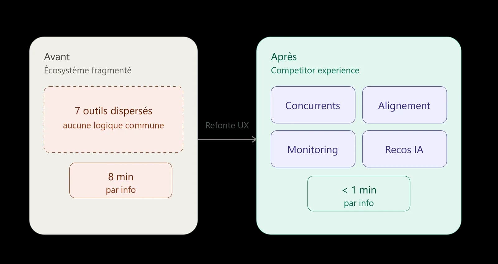
In 2023, price managers used seven different products daily, each designed independently. To analyze a competitor's price, they had to:
- open a first tool,
- retrieve a reference,
- carry it over into several other tools,
- manually recompose the information themselves,
- then finalize their decision elsewhere.
This otherwise simple task became fragmented, slow, and frustrating. Users voiced the same pain points: "too long, too complex, too scattered." Beyond an experience problem, this fragmentation had become a genuine drag on competitiveness.
Understanding the complexity: analyzing the real task
Before imagining a solution, I wanted to understand what was really happening on the ground. I analyzed real user journeys, observed the day-to-day task, interviewed teams in France, Spain, Italy, Poland, and Portugal, and consolidated existing data. Two numbers revealed the scale of the problem:
- 8 minutes on average to align product information across multiple sources,
- 3 minutes to understand a competitive pricing situation.
Multiplied across the number of references and countries, these durations added up to tens of thousands of hours lost every year. On top of that, a common frustration: despite their experience, users had to relearn the interface with every product change. Nothing was harmonized — not the logic, not the structure, not even the underlying business concepts. Cognitive load exploded, and analysis became laborious.
Identifying the opportunity: unify without adding complexity
Users didn't need a new tool: they needed a unified journey, a continuous task, a coherent experience that brought information together instead of scattering it.
I proposed a modular approach that would:
- extract the tasks common to the existing tools,
- isolate local specifics without losing them,
- orchestrate the whole into a unified experience architecture,
- and create an interface able to evolve at the pace of the business.
The goal wasn't to merge products, but to rethink the very model of the pricing experience: shift to a logic where each task produces its own experience module, integrated into a seamless journey. This approach set off a major architectural shift: within the Product Digital Platform (PDP), we no longer talk only about "products," but now about experiences.
The design: orchestrating a fluid journey
Based on the flows observed across countries, I rebuilt a complete picture of the competitive analysis task. This mapping revealed how users actually thought, and how data needed to be orchestrated to become useful:
- Data orchestration: all competitive information is now brought together in a clear, hierarchical structure, readable at a glance.
- Reduced mental load: important signals are surfaced, priority actions are clarified, and secondary details are pushed aside to avoid cluttering the view.
- Unified modules: the former tools become modules within a single experience — competitor overview, alignment analysis, monitoring, price control, recommendations, and so on.
Smatch then became the Competitor Experience: a single, orchestrated entry point, capable of guiding the user from diagnosis to action, without interruption or loss of information.
The impact: performance, fluidity, and transformation at scale
The task that used to take 8 minutes to align information across multiple sources now takes just one minute. Across European countries, that represents more than 63,000 hours saved.
Competitive analysis, once confusing or too time-consuming, is now understandable in 20 seconds. The regained fluidity frees up the business: less time spent operating tools, more time spent analyzing, deciding, and steering.
The SUS score reached 81, and user feedback confirms the value of a journey that is now seamless:
The whole architecture is clearer, everything flows naturally. You see the competitors, the stores, the AI's suggestions, and you can act immediately.
LMES user
We'd been waiting for this solution for a long time. We'll have 45 competitors next year, and we can finally compare everything efficiently.
LMPL user
Beyond the time savings, this redesign restored trust, created a shared language, and helped kick off an experience-first vision now being adopted across the pricing scope.
Transforming the platform: from product to experience
This work wasn't limited to optimizing a single tool. It introduced a new UX architecture model:
- products become modules,
- modules integrate into a unified experience,
- AI strengthens understanding instead of adding complexity,
- and data finally converges in one place.
This shift laid the groundwork for a more legible, scalable, business-oriented platform, now used as a reference for other strategic initiatives.
My role
- End-to-end ownership of the UX redesign,
- field research and understanding of the real task,
- systemic simplification and experience architecture,
- design of the modules and cross-cutting journeys,
- close collaboration with business, product, data, and tech,
- building an experience model exportable to the rest of the platform.