In most B2B teams I've worked with, the default answer to a list of data is a datatable: columns, sorting, filters. It works, and it's fast to build. But it shows the attributes of an object and never lets the user recognize the object itself. They scan rows of data. Nothing concrete.
On a recent project, the first request was exactly that: one more table to display products. It felt natural, since the request moves fast and users are used to it. Habit is not a design argument on its own. The real question is what the user should remember about the object, not how quickly it can be displayed.
Table view
| Name | Genre | Year | Hours |
|---|---|---|---|
| Counter Strike | FPS | 2004 | 2221,8 |
| Knights in Tight Spaces | Tactics | 2023 | 27,8 |
| Palworld | Survival | 2024 | 79,2 |
| Hollow Knight | Metroidvania | 2017 | 27,4 |
| TUNIC | Action-adventure | 2022 | 37,4 |
| Thronefall | Tower defense | 2023 | 27,5 |
Object view

Counter Strike
FPS2221,8 hours played
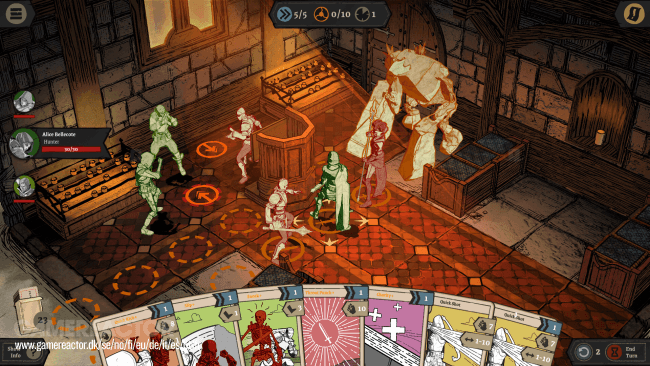
Knights in Tight Spaces
Tactics27,8 hours played

Palworld
Survival79,2 hours played

Hollow Knight
Metroidvania27,4 hours played
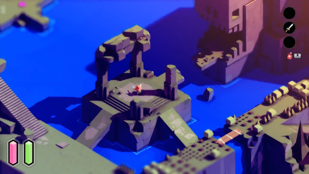
TUNIC
Action-adventure37,4 hours played

Thronefall
Tower defense27,5 hours played
Starting from an object instead of a table changes the lens entirely. What is this object? What attributes actually define it, rather than which columns fit on screen? The table still earns its place afterward, for comparing items or acting on volume, but as a secondary view rather than the entry point. Once the object view exists, most users end up preferring it to the old table.
I’m Maxime Boulogne, I share these notes and case studies to prove UX only serves the light side of the Force.